Golden Batch Analysis in Python
I replicated a comprehensive analysis of batch data using Python, including Principal Component Analysis, Partial Least Square Regression, and error assessment between "golden" and similar batches, yielding valuable insights into process performance.
Objective
I recently came across a paper titled "Golden Batch Identification Using Statistical Tools as a Part of Asset Performance Management" by Modhuli Goswami. This paper intrigued me as it delved into the use of various statistical tools to identify numerical parameters that influence a target variable. The author conducted an extensive analysis of batch data using Matlab. Given my experience with Python, I decided to replicate the process using randomized batch data to gain insights of my own.
Data Preparation
Before diving into the analysis, it's crucial to understand the dataset's structure. This knowledge allows us to structure other potential datasets in a similar manner. A snapshot of the dataset is presented below:

The first row consists of numbers ranging from 0 to the last column. The target variables, which we aim to assess for each stage, are labeled as 'Stage X Target,' while the feature variables associated with these targets are named 'Stage X Feature n,' where n is an integer starting from 1. The first column identifies the 'Batch' of the process as 'Bn,' where n is a unique integer representing each batch. Some cells are intentionally left empty to mimic real-time data collection; these will be filled later using K-Nearest Neighbor (KNN) imputation. A sample Excel file is shared below.
Using Python GUI to Select Dataset
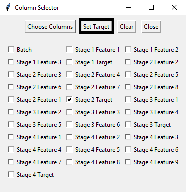
Starting with a randomized dataset, I employed Python's GUI functionality to input the necessary parameters into the code. This involved selecting the sample dataset (via 'Browse and Confirm Excel File') and specifying the feature (by choosing columns) and target (setting the target) components.


Creating a Folder
Subsequently, I created a folder to store the analyzed plots and Excel files.

Data Analysis
Task 1: Perform Principal Component Analysis (PCA) & Pareto Chart
PCA, a dimensionality reduction technique, is commonly used to analyze datasets with numerous features while preserving as much original variability as possible.
The initial task was to conduct PCA on the dataset using scikit-learn's PCA function. In this process, all numerical columns except the target column were considered as features. The number of components (n_components) was determined accordingly. To ensure consistency, the feature parameters were standardized using the StandardScaler preprocessing technique, which normalizes values to have a mean of 0 and a standard deviation of 1. This guarantees uniformity while performing PCA.
The explained variances of each principal component were measured and utilized to create a PCA Pareto chart. This chart was generated based on a user-defined cumulative variance threshold (expressed as a percentage of the total variance), typically set at 80%. This approach selects only the principal components that have the most significant impact on the output. The chart displays individual principal components' explained variances on the primary y-axis and cumulative explained variance threshold as a percentage of the total variance on the secondary y-axis. Usually, 3-4 principal components fall within this threshold, aiding in parameter selection for subsequent analysis.

Figure 6 shows that first four principal components (PC1 to PC4) explain around 80% of the variance. As such, the analysis is now better equipped with reduced dimensionality, since PC5 to PC8 can now be removed from further analysis.
Task 2: Save a Text File of Parameters, Target, Threshold, and Principal Components
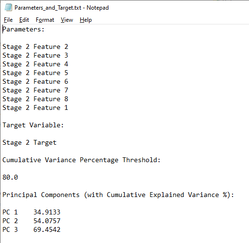
To provide a summary of the analysis, a text file is generated, listing the selected features, the target, and the principal components falling within the cumulative variance threshold.

Task 3: Create a Biplot of the First Two Principal Components
In PCA, a biplot combines information on how the original variables load onto the principal components (loadings) and how the observations are projected onto these components (scores). This visualization aids in understanding how variables and observations relate to each other in the reduced-dimensional space defined by the principal components.
A biplot plot is generated to assess which parameters have the most significant impact on PC1 and PC2, making it easier to identify the parameters of interest.

The biplot (Figure 8) reveals that parameters B (corresponding to Stage 2 Feature 3) and C (associated with Stage 2 Feature 4) exhibit their closest proximity to PC1 and PC2, respectively. Interestingly, while parameter B significantly impacts PC1 in a negative manner, parameter C similarly exerts a substantial negative influence on PC2.
However, our focus also lies in assessing the projection of both parameters A and E onto the principal components, particularly concerning parameter B.
Furthermore, this analysis sheds light on collinearity, as parameters A and H appear to align closely in both direction and magnitude, indicating a high degree of correlation between them. This indicates that either A or H can be removed as a feature, without affecting the analysis.
Task 4: Create a Normalized Box Plot
Next, normalized box plots for each feature and the target are created using StandardScaler. These plots visually represent data spread, central tendency, and the presence of outliers for each variable (feature). This visualization helps identify variables with high variability or outliers that may affect PCA results. To gain better insights and remove outliers, consider using noise reduction techniques explained in my post on filtering noisy data in Python.

Task 5: Find the Maximum Correlation of Each Principal Component with Each Parameter
Determining the correlation coefficients of each feature with each principal component provides a detailed summary of which parameter has the most significant positive or negative impact on the principal component. This information guides the selection of parameters for further analysis.

Analyzing Figure 10, we can discern two critical observations:
The feature variables with the highest absolute correlation coefficients are highlighted in bold. Notably, certain features, such as 2, 6, 8, and 1, exhibit the strongest correlations with PC1, while others are more distinctly associated with specific principal components (e.g., feature 4 with PC4 and feature 5 with PC2).
The presence of multiple features represented by a single principal component implies a significant degree of multicollinearity. Consequently, it may be advisable to consider retaining only the feature with the highest correlation within the group.
Moreover, it's worth emphasizing that the magnitude of the correlation is a crucial factor to consider. Therefore, in this context, feature 5 would be a preferable choice over feature 4 as a principal component.
Task 6: Perform Partial Least Squares Regression Analysis for All Batches
Ordinary Least Squares (OLS) regression analysis is the initial choice for fitting a regression model. However, multicollinearity can lead to unstable and unreliable regression coefficients. Partial Least Square Regression (PLSR) addresses this issue by creating new orthogonal latent variables (components) based on linear combinations of the original predictors, reducing multicollinearity.
In this step, machine learning (ML) is used to create scatter plots between actual and predicted target variable values. Batch-wise predicted and actual values, along with R-squared and Mean Squared Error (MSE) values, are plotted to evaluate the robustness of the ML regression model.


Task 7: Perform Partial Least Square Regression Analysis for Golden-like Batches
The definition of 'golden' batches is user-defined. Golden batches can be determined based on a predefined protocol if analyzing consistency batches or using a new threshold to challenge the existing protocol. In either case, golden batches are filtered, and PLSR analysis, similar to Task 6, is performed exclusively on the golden-like batches.
It's essential to note that the regression coefficients and intercept are fitted to the original unscaled data for real-time predictive analysis. An Excel file is created to list the golden-like batches after filtering the original data, and this file is saved in the previously created folder.


An R-squared value of 1.00 implies that the PLS fit model is robust and can represent the current model for future predictions.
Task 8: Plotting Mean Absolute Difference of Errors for Principal Components between Absolute Golden Batch and Golden-Like Batches
Selecting the absolute golden batch among the golden-like batches is also a user-defined task. Depending on the objective (maximizing, minimizing, averaging, or finding the median batch), a specific batch is chosen as the Absolute Golden Batch (AGB). The parameters identified as principal components in earlier analyses are scaled using StandardScaler, and the absolute differences between each golden-like batch and the AGB are plotted as a stacked bar plot.

Within Figure 15, batch B68 has been designated as the absolute golden batch (AGB), having achieved the highest target value among all batches with golden-like characteristics. This visualization illustrates the extent of variation in three parameters, quantified as scaled absolute differences from the AGB, for each batch resembling the AGB.
In this context, batches B33 and B74 emerge as the closest counterparts to the AGB in terms of these parameter variations.
Next, an Excel file is created, containing multiple worksheets, each with batches falling within a defined integral value range of cumulative absolute parameter differences. This allows users to select batches for calculating optimal parameter values based on AGB and golden-like batches within the designated error difference.

In Figure 16, it is evident that there are 9 batches exhibiting a cumulative mean absolute error difference of 1. However, this count increases significantly to 52 batches when the difference is extended to 2. Thus, choosing the batches based on the error difference is also a contextual one.
Task 9: Calculate RMSE Values for Principal Components between Golden-like Batches and Absolute Golden Batch
As an additional analytical task, root mean squared error (RMSE) values for the threshold-driven golden-like batches are calculated and added to the dataset in relation to the AGB. This provides further insights into batches that closely match the AGB and can be valuable for assessing the overall batch process.

Figure 17 displays the RMSE values for all parameters following the filtration of golden-like batches based on a cumulative mean absolute error difference of 2. These refined batches can then be sorted according to the RMSE values of a specific feature, facilitating further in-depth data analysis.