Creating an Impurity Dashboard using Power BI
Discover actionable insights and enhance data-driven decision-making with a powerful Impurity Dashboard built using Power BI.
Unlocking insights from a large Excel data table of impurities across diverse experiments with varying temperature and shelf-life conditions is made effortless with robust Power BI visualizations. These powerful visualizations enable effective customization and presentation of data, facilitating a deeper understanding of the experiments. In this article, we leverage a dummy dataset of biosimilar impurities, along with their respective RRT (relative retention times) values, to address key questions:
Which impurity(s) exhibit the highest average composition across experiments?
How do impurity compositions change with different shelf-life durations for impurities 29, 30, 31, and 32?
Are there any observed correlations between specific impurities?
What are the general trends of impurity composition by temperature for each impurity?
Which impurities demonstrate significant increases when biosimilar samples are stored for longer shelf-life durations?
By applying machine learning, data visualization, and analysis techniques, we can effectively address these questions and gain further insights.
A typical unstructured data table is often represented in the following format:
This table has the following data structure :
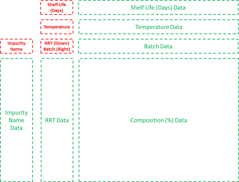
In the provided unstructured data table, the headers are represented by red cells, while the green group of cells contains the data values. The table presents the composition of each impurity in a matrix format, where rows represent individual impurities, and columns correspond to shelf life, temperature, and batch number. However, to ensure optimal visualization in Power BI, modifications are required for structuring and organizing the data table.
Restructuring Data in Power BI
1. Load the data table in Power BI.
Home (tab) > Excel Workbook > select 'Sample Impurity Table' > Transform Data
This opens the Power Query editor.

2. In Queries bar, duplicate the Sample Impurity Table and rename the duplicate table to 'Impurity Lookup Table'.
right-click 'Sample Impurity Table' > Duplicate
right-click duplicate 'Sample Impurity Table' > Rename > 'Impurity Lookup Table'
3. Modify 'Impurity Lookup Table' as follows:
Keep only the columns for 'Impurity Name' and 'RRT' values.
Select both columns 1 and 2 and right-click > Remove Other Columns
Remove the top rows except headers and values from the table.
Home (tab) > Remove Rows > Remove Top Rows > Add '3' to the Number of Rows > OK
Remove empty rows.
Home (tab) > Remove Rows > Remove Blank Rows
Remove the last rows without values.
Home (tab) > Remove Rows > Remove Bottom Rows > Add '1' to the Number of Rows > OK
Use the first row for header values.
Home (tab) > Use First Row as Headers
Change data type of 'RRT' column to 'Decimal Number'.
Click icon next to RRT header > Decimal Number
Round the 'RRT' values to 2 decimal places.
Transform (tab) > Rounding > Round... > '2' Decimal places > OK
Change datatype of 'RRT' to 'Text' to make it easier to use in slicers.
Click icon next to RRT header > Text
4. Return to the original 'Sample Impurity Table' and do the following modifications:
Transpose it.
Transform (tab) > Transpose
Remove the empty 'Column 1'.
Right-click column with null values > Remove
Use first row as headers.
Home (tab) > Use First Row as Headers
Rename Column 1 as 'Shelf Life (Days)' and Column 2 as 'Temperature', 'Impurity Name' as 'Batch'.
Remove first row.
Home (tab) > Remove Rows > Remove Top Rows > Add '1' to the Number of Rows > OK
Unpivot all other columns containing composition (%) data except the 'Shelf Life (Days)' , 'Temperature' and 'Batch' columns.
Select all three columns > Transform (tab) > Unpivot Columns > Unpivot Other Columns
Rename 'Attribute' to 'Impurity Name', and 'Value' to 'Composition (%)'.
Change data type of 'Composition (%)' column to 'Decimal Number'.
Click icon next to Composition (%) header > Decimal Number
Round the 'Composition (%)' values to 2 decimal places.
Transform (tab) > Rounding > Round... > '2' Decimal places > OK
5. Apply all changes and close the query editor.
Home (tab) > Close and Apply
Creating Impurity Dashboard in Power BI
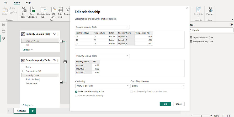
After modifying both tables, we have to check the relationship between the tables.
6. AI will create an automatic connection between the impurity data table and the impurity lookup table.
Go to Model view.
Click on the connection and check if 'Impurity Name' is selected for both tables.
Also, check if the Cardinality is 'Many to one (*:1)'.
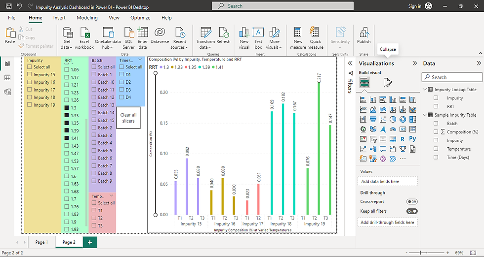
7. Once the relationship is checked, go to Report view and make the following modifications:
Add 5 Slicers to the report dashboard.
Drag each of the following to one slicer from the data tables on the right : Impurity Name, RRT, Batch, Shelf Life (Days), Temperature.
Add a Clear all slicers button to the dashboard.
Insert (tab) > Buttons > Clear all slicers
Add a Clustered column chart to the dashboard.
X-axis - Batch, Shelf Life, Temperature
Y-Axis - Average of Composition (%)
Legend - Impurity Name or RRT
This sets up the basic impurity dashboard for the end-user to manipulate and get the visualizations as they choose.

Answering Business Questions
To answer questions asked earlier, we will introspect each question individually.
1. Which impurity(s) showed the highest average composition across experiments?
This can be done by adding a Q&A visualization and asking it directly : 'Which impurity name excluding Blank has highest average composition (%)'
Initial answer :
Impurity 21 with average composition (%) of 77.56%
However, it's important to note that Impurity 21 is actually an adduct of Biosimilar 1 and not considered a standalone impurity. Therefore, for a more accurate impurity analysis, it is recommended to exclude Impurity 21, Biosimilar 1, and any blank categories from further consideration. By doing so, the analysis can focus solely on the relevant impurities and ensure meaningful insights are derived.
Exclude these components from the impurity table using Filters and manipulating the Clustered column visualization.
X-axis : Impurity Name
Y-axis : Average of Composition (%)
Legend : RRT
Final answer :
Impurity 1 with RRT 0.59 and average composition (%) of 0.74% has the highest composition across all experiments.

2. Which impurities increased (or decreased) in composition for different shelf-life durations?
This requires creating a Line chart that shows average composition (%) of each impurity with shelf-life (days) as the independent variable.
X-axis - Shelf Life (Days)
Y-Axis - Average of Composition (%)
Legend - Impurity Name or RRT
Following visualization shows impurity trends for Impurities 29, 30, 31, and 32.
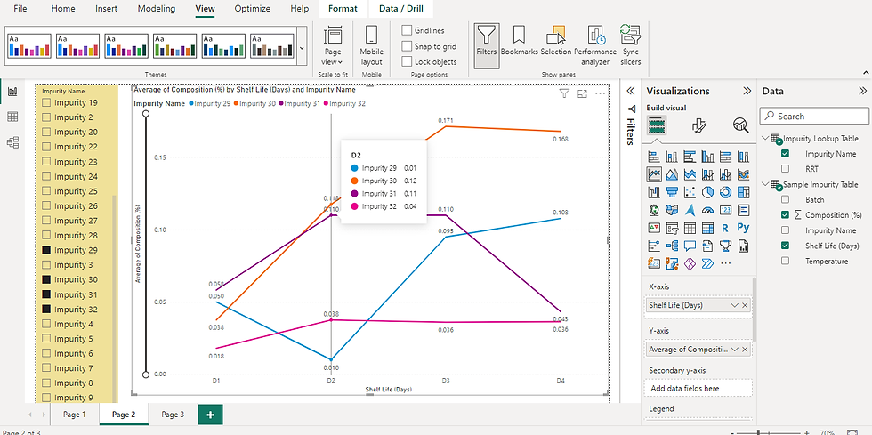
Answer :
While impurities 29 and 30 increase with increase in shelf-life, impurity 31 decreases, and impurity 32 remains constant.
3. Is there a correlation observed between certain impurities and experimental conditions?
To get the correlation between composition (%) of various impurities, we need to pivot the impurity columns.
Duplicate 'Sample Impurity Table' and rename it 'Sample Impurity Pivot Table'.
Ensure that each impurity gets a separate column whose composition (%) values can be used later in building a correlation plot.
Select 'Impurity Name' and 'Composition (%)' columns > Transform (tab) > Pivot Column
Next, download Correlation Plot custom visual.
Click on the ellipses (...) on Visualizations pane > Get more visuals. This opens up the Power BI visuals window > Search for Correlation Plot > Download
Once the Correlation Plot custom visual is downloaded, add it to the dashboard.
Drag all impurity columns from the data fields to Values > Ensure that in Format your visual section, under correlation plot, Element shape is set to 'shade' and Draw clusters is set to 'auto'.
This creates a correlation plot with correlation values between every pair of impurities displayed in a heatmap as shown below:

To get a detailed view, we can opt for lesser impurities to compare as shown below:

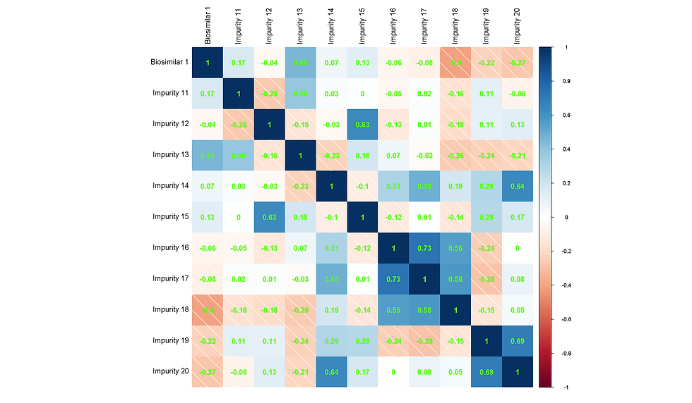

Answer: Based on the above plots, the following conclusions can be drawn:
Impurities 1 to 10 exhibit a strong positive correlation with Biosimilar 1, except for Impurity 7, which appears to be uncorrelated.
Notably, Impurity 21 demonstrates a significant negative correlation with Biosimilar 1, suggesting that it may be an adduct or intermediate byproduct of the biosimilar.
The plot provides auto-clustering, enabling the grouping of impurities into four distinct clusters:
Cluster 1: Biosimilar 1, Impurities 1-4, 6, 8-10, and 13.
Cluster 2: Impurities 16-18, 21, and 24.
Cluster 3: Impurities 19, 20, 22, 28, 31, and 32.
Cluster 4: Impurities 5, 7, 11-12, 14, 15, 23, 25-27, 29-30.
These observations provide valuable insights into the relationships and groupings among the impurities, facilitating further analysis and decision-making processes.
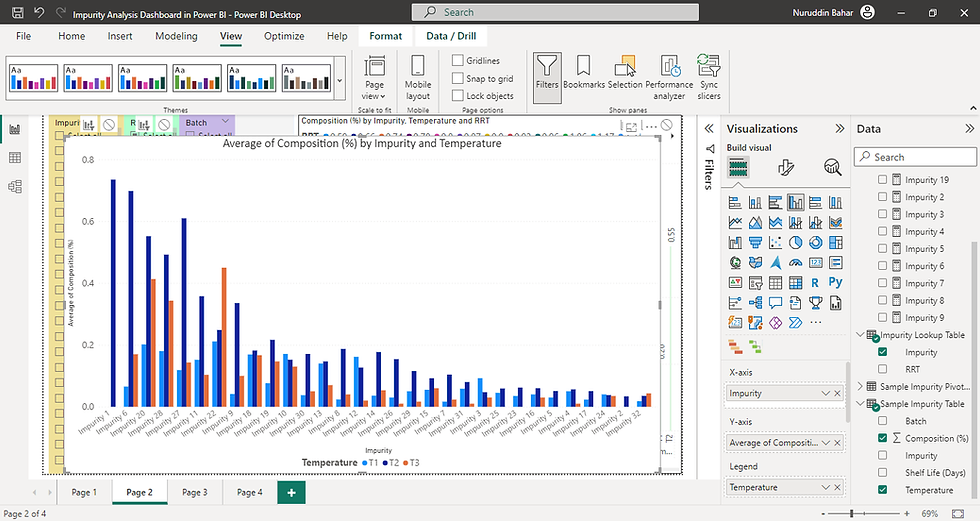
4. What is the general trend of impurity composition by temperature for each impurity?
5. Which impurities increase drastically when the biosimilar samples are stored for a longer shelf-life?
To observe the trend, we can create a Clustered column chart
X-axis - Impurity
Y-axis - Average of composition (%)
Legend - Temperature
The graph is shown below:
To gain a clearer understanding of the variation in impurity levels across different temperatures, a line plot can offer more comprehensive insights. By plotting the RRT values against temperature, we can easily identify the temperature with the lowest average impurity content and pinpoint the one with the highest average impurity content.
To observe the trend, we can create a Line chart
X-axis - RRT
Y-axis - Average of composition (%)
Legend - Temperature

Answer :
On an average, there are greater amounts of impurities at temperature T2, while T1 has the least amount of impurities.
This also answers which impurities increase drastically in composition - RRT 0.87, 1.43, and 1.70.